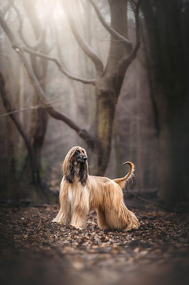
Sometimes I remove colors to make a photo more colorful
Why one of the first things I do when editing is actually remove most of the colors from the frame.

When I edit a photo, one of the first things I do is kill most of the colors in it.
At the beginning, I did exactly the opposite. If there was green, I made it greener. If there was sky, of course it had to be blue. If the dog was brown, let's give that some extra color too. You can very quickly end up with a photo where every color looks great on its own, but together they're all fighting for attention. I see this a lot with photographers at the beginning of their journey, and my old photos are definitely not innocent either.
Today, I almost always start by reducing colors and saturation, and trying to bring most of the frame into the same general direction, warm or cool. Most importantly, I get rid of colors that have no reason to be there. If I'm photographing a brown dog in a green forest, what the hell is blue doing in the frame?
I usually look at the photo and decide which colors are actually important to it. The dog's natural colors obviously matter, and then maybe there are one or two colors in the environment that help create the atmosphere I want. Everything else has to justify why it's there. If it doesn't add anything to the photo, I don't need it screaming for attention in the background.
In most photos, 2–4 main colors are more than enough for me. Even in naturally colorful scenes, like a tulip field, graffiti or colorful architecture, I'll still try to organize those colors into a clear palette instead of letting every possible hue survive just because it happened to be there when I pressed the shutter.
This doesn't mean turning everything gray or desaturated. It's almost the opposite. Once I've decided which colors belong in the photo, I can give those colors a little more strength. When three colors don't have to compete with seven others, suddenly those three colors feel much stronger.
It also helps the dog. Color is another thing our eyes react to, just like brightness, contrast and sharpness. If there are strong colors everywhere, they're all asking us to look at them. If I control the palette, I can use color to keep the attention where I actually want it.
Of course, there isn't one correct palette for every photo. Some photos want to be warm, some work much better cool, and sometimes one small contrasting color is exactly what makes the entire frame interesting. The important part for me is that those colors are there because I decided I wanted them there, not simply because the RAW file gave them to me.
Fewer colors, less visual noise, a cleaner frame... and strangely enough, sometimes the best way to make a photo feel more colorful is simply to remove colors from it.